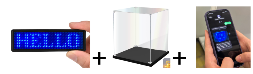
How might a glowing “nametag” launch a story game tied to a physical exhibit?
Below we reveal a clever use of increasingly cheap LED signs ($10-30 USD) as a bridge to hidden stories and play. It is part of our research into respectful augmentation that (1) fits into an existing public space – especially libraries and community centers; (2) reveals a deeper story; and (3) and draws the right kind of attention to the experience, not too flashy but still intriguing.
How it Works
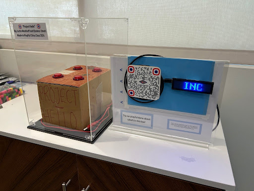
- Imagine that your eye is caught by something across the room. It’s a fancy transparent box with a mysterious object and a glowing sign stating there is an “INCOMING MESSAGE!”
- Intrigued, you stop by during a break and scan to enter a portal that begins your interactive story on your phone.
- On your phone, the visuals and the narrative weave multiple stories together, including the mysterious box (the display object), the augmented story (AR storytelling), and the emergent behavior of the player-participant.
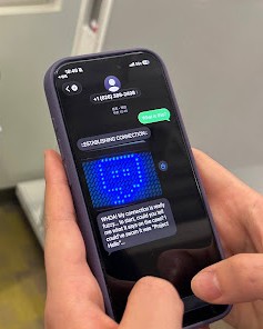
What makes it interesting (and challenging)
It’s surprisingly hard to transfer attention from a physical object into a digital story in a respectful way. The key is to not overwhelm the player at the start with a large gaudy display. Instead, it helps to hint at the hidden narrative and entice viewers to seek it out themselves.
Design Lessons
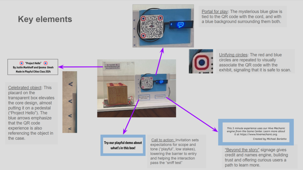
- Elevate the object. The transparent box makes the object special – it doesn’t just protect it, although that doesn’t hurt.
- Sniff test. The player only begins if they think it might be worth something, and if they trust the experience. The augmented story is partly interesting because it promises to reveal more about the makers of the mysterious object.
- Portals not links. If the experience is good, the opening is like a portal. Foam and cork for dimensionality helped, but the visual design of the QR code has to feel different than an informational link. The language of “portals” hints at the kind of experience we want to create.
Visual deconstruction:
Iterations: Garnering attention with respect (Bigger is not always better!)
Our iterations reveal some of the core design insights.
At first, we were tempted to use a large display and draw maximal attention. But we had to fit into an existing room that its own regular events and classes. Respecting the space was easier with the “mild glow” from a display at the side of the room. In other words, we wanted to get attention – but the right kind, and not too much. This was harder than it sounds.
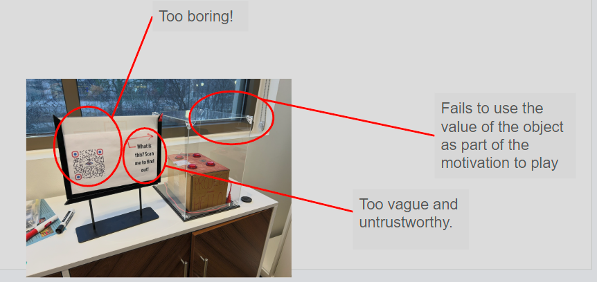
The simple version with paper was too boring, and failed to use the fascinating exhibit item :
Avoid:
- Big blinking lights, loud noises or a huge sign. This doesn’t respect the established space, which is a classroom with people actively using it. Displays must be somewhat “quiet” and to the sides.
- Just a QR code on the display case. Not interesting enough. More curiously, it lacks the double-bottom line motivation.
- No label on the project itself. With no identifying features on the display except for a drawn arrow, the display looks unpolished.
- All on one piece of paper. The lack of depth in the QR code and the text box leave this sign looking boring and untrustworthy.
Design tool: Foam and cork for pop-out layering
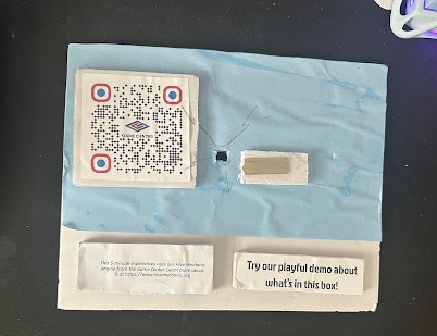
To tell a layered story, it helps to have physical depth. We are trained to see layers in the physical world, and we can tap this intuition for visual cues in our augmented storytelling. Prototyping can be with cardboard or foamcore.
Keep it quick and dirty! Here’s the wrinkly early version:
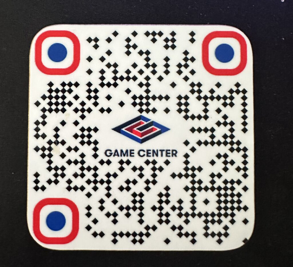
For polish, one tactic is to use a printable custom coaster (on Amazon, $20), which comes with nicely rounded edges:
Behind the Story
Hi, my name is Michael Barletta and I’m in the Game Design graduate program at American University. I’m also the lead designer behind this prototype, and I wanted to give some backstory behind this design. Since I started at the program, one of the cool things we’ve been able to do is design research. This means in addition to making things, we seek to understand why they are interesting or cool. The physical construction of the exhibit was definitely intimidating, but it was rewarding to see how over time we were able to discover many possible paths to success. One of the most important lessons I learned from this experience was to be brave! Try something and see if it sticks. Once you’ve tried something, show it to your team for a different perspective. By trying a multitude of things over time, you’ll start to see what works or what doesn’t work, what can be changed – and what can’t; we hope this post can accelerate that process for you!
Useful links if you’re making on your own:
Amazon: Display Case ($19)
Walmart: glowing name tag sign ($16)
Amazon: Acrylic Sign Holder ($16)