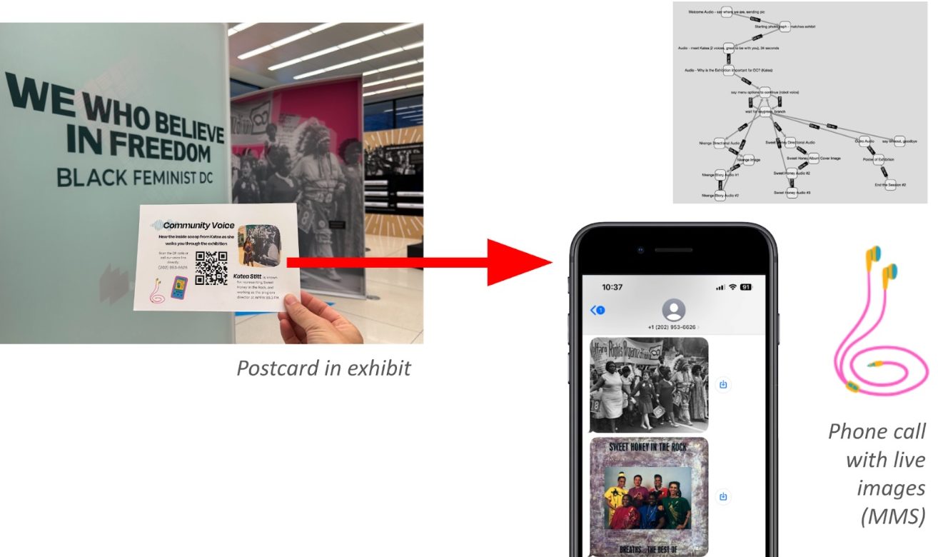
This month we launched an interactive audio project (“Community Voice: Katea Stitt“) with the National Women’s History Museum and the DC Public Library. It is part of a larger exhibit, “We Who Believe in Freedom: Black Feminist DC” that is on view in the central MLK Library through September 2024.
Beyond this launch, more than 20 cities and towns in the past 18 months have created their own games and interactive stories tied to local history. All were trained in part through our federal IMLS grant (Institute of Museum and Library Services) to explore libraries as hubs for interactive storytelling.
THE EXPERIENCE
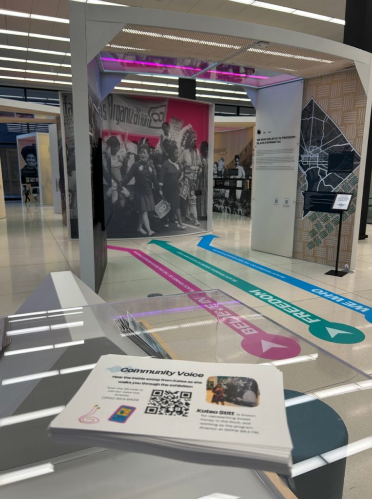
Visitors begin with a postcard at the entrance to the exhibit. The card invites them to “hear the inside scoop from Katea as she walks you through the exhibition.” Using their own phones, visitors scan the QR code to dial an interactive hotline featuring Katea in conversation with project staff.
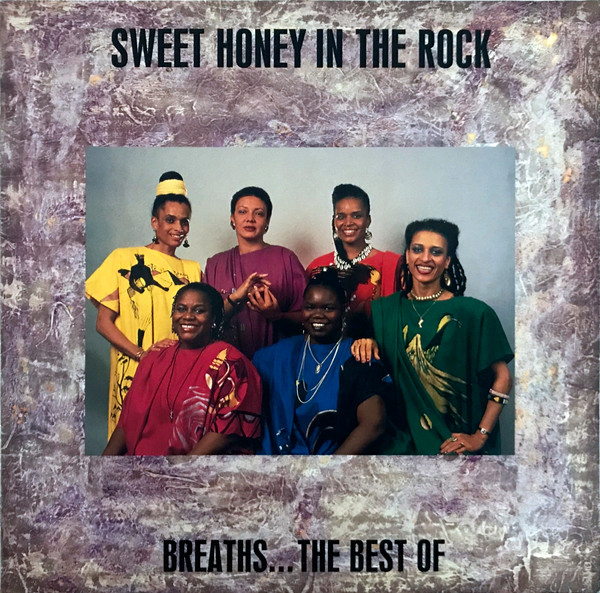
During the call, photographs are sent by the hotline as text messages to accompany the audio (e.g., “I am sending you a picture of the album cover). There are several audio branches so that listeners can choose what they want Katea to tell them more about.
LISTEN:
The right tone is essential for engagement and community-based projects with real accountability. This clip sets the stage for audio that directly addresses the listener and remains engaging, brief and with just enough institutional backing:
EXHIBIT FOCUS
The underlying exhibit is an 18-month installation in downtown Washington, DC. We Who Believe in Freedom: Black Feminist DC traces black feminism in Washington, DC, from the turn of the 20th century through the civil rights and Black Power movements to today. It is the first large-scale in-person exhibit in the 25+ year history of the National Women’s History Museum (NWHM), which has previously been primarily an online museum providing resources and programs through its site. The exhibition was developed in partnership with the DC Public Library and installed in the stunning central branch of the DC Public Library, the Martin Luther King Jr. Memorial Library, which was recently modernized in a $211 Million project.
KATEA AS “COMMUNITY VOICE” AND INSIGHT
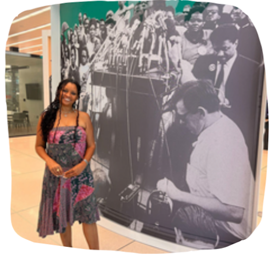
The most important voice in the project is that of Katea Stitt. She is famous for representing Sweet Honey in the Rock, an influential a cappella group that is featured prominently in the exhibit. Katea was also a natural choice for an audio project given her experience with radio, since she serves as the program director at WPFW 89.3 in DC.
Annotated screenshot from Hive Mechanic of the activity, with photographs that are sent to callers from each of the three audio branches.
AUDIO BRANCHING AND NAVIGATION
There were three audio branches for listeners to explore more deeply. Each gave a different opportunity for Katea to reveal hidden insights and connections, and each came with an image for orientation or exploration. First was a dive into Sweet Honey in the Rock, which came with an image of an album cover for the band (see figure above). The second was a dive into Nkenge Touré, an influential activist who is featured in the exhibit and is a personal connection for Katea. Third is a step back to reflect on the importance of the exhibit for DC right now, in Katea’s words – and with a poster of the exhibition sent to the listener’s phone to take home and recruit others to see the important show.
INTERACTIVE MODEL: “INSIDER VOICE-OVER”
Our research team is working to articulate a series of national models for libraries and community museums. Our priority is on accessibility, since no apps are needed for this interactivity, and ordinary residents alongside library staff can create the experience. This design in particular represents a model for making experiences that we call “insider voice-overs.” The idea is to augment an existing mural or display case on local history with authentic behind-the scenes voices and to bring new energy and community insights.
COMPARATIVE VALUE: LIVE AUTHENTICITY AND COMMUNITY EXPERTISE
We feel the obsession with fancy apps and expensive museum exhibits has left an opening. Our potential user base is very large, since the vast majority of local libraries and museums have almost no budget and are stretched thin. But our vision is also different – beginning with the tone. In contrast to traditional museum language, the narrator is not faceless but rather a trusted community voice with a particular perspective. Rather than summarize all perspectives fairly, we prioritize a more deeply authentic and human feel that comes from hearing the specific connections of one unusually connected insider. Obviously, the choice of the community voice is essential – just as it would be in choosing a keynote speaker.
WALK-THROUGH:
For makers and librarians who want to make their own, we document some of the experience and scaffolds below.
(1) At the entrance to the exhibit, visitors can see the postcard sitting out:
(2) The postcard looks like this (front and back):
(3) Scanning the QR code on most phones opens a prompt to dial the phone number. You can generate QR codes like this with free tools (e.g., QR Code Monkey).
(4) An image is immediately sent to the caller’s phone:
→
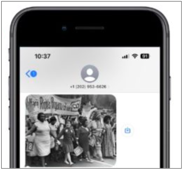
…and the audio tells them to stand in front of the same image in the exhibit:
(5) The caller is then given a choice of what to hear next. On the backend, we used the robotic text-to-speech because it feels functional and like a different personality than the other voices on the line. It is also easy to edit the text to hear something different. Here is how the text appears in our Hive Mechanic editor, where we use phonetic spelling:
..it sounds like this:
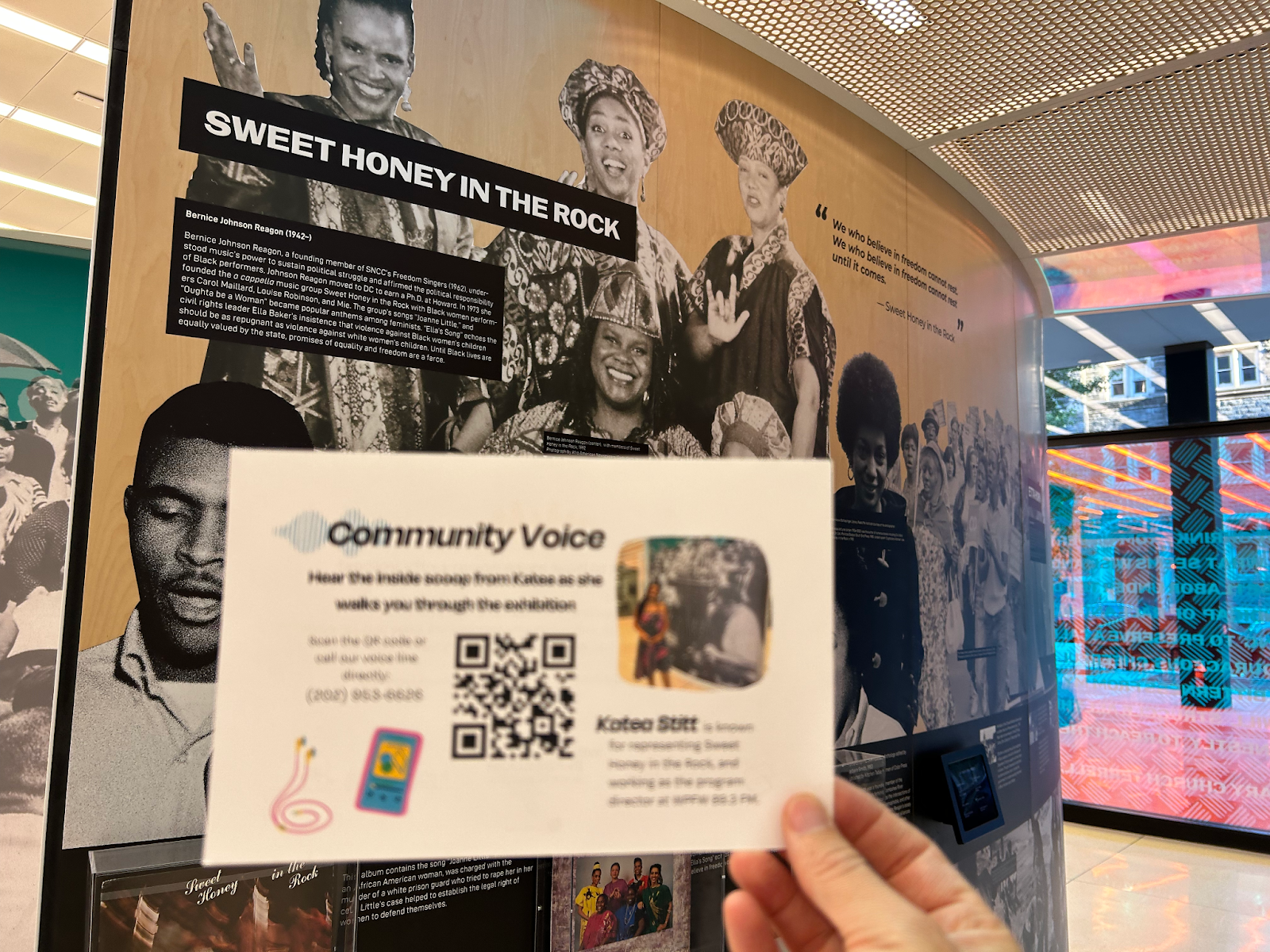
(6) Let’s say the caller chooses to hear more about Sweet Honey in the Rock, and pushes ‘2’ on their phone. Immediately, they first receive the spatial guidance to get to the right part of the exhibit:
As they walk, they see the section for Sweet Honey (photograph at left) and receive a multimedia message of the band’s album cover (at right is the image sent to phones).
Then they hear:
Afterward, they return to the main menu (see above)
CONTENT SUMMARY:
To see an outline of the content, two views in Hive Mechanic are useful. First is the list of folders or “Sequences” (at left). Second is the story diagram, which comes automatically by connecting the Hive Mechanic “cards” (at right).
PARTICIPATORY DESIGN:
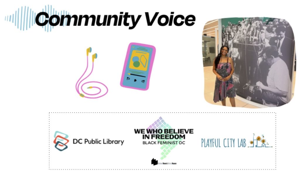
Our goal was to empower ordinary staff (i.e., not computer programmers) to edit the interactive experience. For this launch, staff from NWHM and the Library recorded all audio and edited the interactive experience in our Hive Mechanic authoring tool. The postcard was jointly created by NWHM staff and our Playful City team using accessible tools (Canva in this case after prototyping in Google Docs), and printed on public library printers. The “we” in this project represents a genuine collaboration, with a few individuals deserving special mention: Benjamin Stokes was lead for the interactive project, as director of the Playful City Lab at American University/Game Center. Rebecca Ljungren is the Education Programs Manager at NWHM. Natalie Campbell directs Library Exhibits at MLK Library for the DC Public Library. Hazel Arroyo and Meagan Couture are consultants for the Playful City Lab, and served as interaction designers and strategists for the project; both are graduates of the AU Game Center. Backend development is thanks to Chris Karr of Audacious Software. David Quick is the Adult Services Coordinator for DC Public Library. And of course, Katea Stitt (see above for full description) as expert analyst and our inaugural community voice.
SCAFFOLDS FOR FUTURE USE:
(1) The interactivity model with decision tree can be viewed as an image, or directly copied in Hive Mechanic; (2) we created an Interview Guide to help staff pivot away from long, pre-written descriptions to a more informal, conversational interview style that is different – and leads to long oral histories to a pre-tested kind of audio that is highly engaging, distinct from the traditional “exhibit voice,” and can be recorded and edited in minimal time. (3) The postcard provides a template for the framing and call to action.
FUTURE RESEARCH: Design Principles and Balancing.
Our stakeholder interviews have yielded a ton of insights that we are writing up in several forms (forthcoming). Remember, our longer-term goal is to democratize the process of making experiences like this; we are particularly interested in identifying principles that might reduce the time that non-experts must spend in audio editing and experience design, ideally shifting the balance so that 90% of their time is spent on focused content generation, almost no editing, and quick balancing of the experience. Stay tuned!