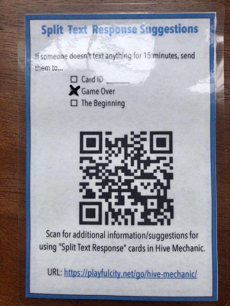
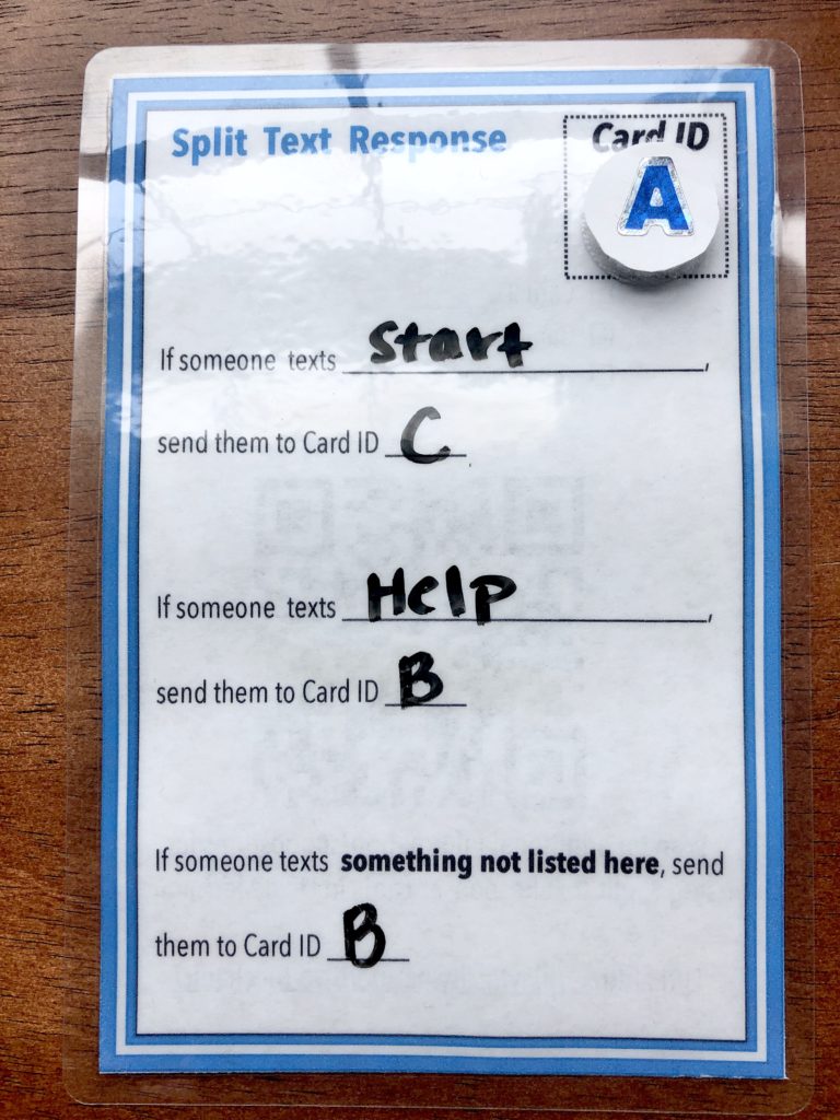
We developed physical cards as an on-ramp for making games in Hive Mechanic. In the online system, the card metaphor continues — and in fact, is central to how we help non-programmers to craft interactive stories and experiences. We were surprised at how making the paper cards helped us to simplify language for the digital interface — and reminded us how paper-prototyping is not just an early-phase or “beginner” tactic, but can yield insights at many points in the design process.
As inspiration, there are already some great physical cards for game design such as Mixed Reality Game Cards, PLEX Cards, and MethodKit. In our case, the physical Hive Mechanic cards are a way to visualize a game flow for rapid prototyping and ideation of game concepts. In contrast to the aforementioned cards, our cards are designed to be the “rough draft” of a game that is then ready to be transferred to the digital card-based game engine.


(this card indicates how the system will respond after it receives a text message)

A primary goal was to facilitate procedural thinking for those who lack technical training. (For example, it is important for activities to respond “only if” certain text messages are sent.) Yet our approach online is quite different than many educational tools for making games like Scratch, which try to teach you to code. Instead, we try to make procedural thinking more natural and conversational. The result should feel more like narrative: somewhat linear at first, with a structure inspired partly by Mad Libs. This is immediately accessible in the short-term and more compatible with narrative storytelling in the longer term. And it remains a way to discretely build up procedural thinking skills, driven more by what users want to express and do next rather than an elegant visualization of the interactive system.
We went through several rounds of testing the cards with folks who do not have a technical computing background to come up with the current language. Additionally, we found that by keeping the language consistent across the physical to the digital, we improved alignment and were forced to confront some of our hidden assumptions as we went.

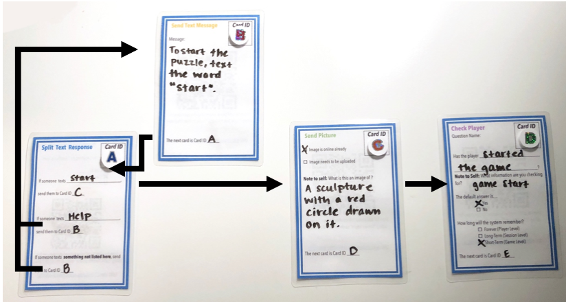
The next design challenge was figuring out how to demonstrate game loops and systems through cards. More literally, we needed a way of “connecting” the cards to each other to demonstrate how a game flow works. We ended up using a naming system of the physical cards where each card has an ID that can then be referenced on any other card. Additionally, we found through testing that the way the cards are laid out also has an impact on the understanding of the game flow, with the most understanding coming from laying the cards out in a semi-chronological fashion.
While Hive Mechanic and these cards are still very much a work in progress, we feel that our investments in an accessible and consistent card metaphor are beginning to pay off — and will do so exponentially when we move to larger workshops and educational settings.
For more of our conceptual thinking, see our article proposal on “Hybrid cards to simplify game design.”
This post was contributed by Hazel Arroyo, a professional game designer and member of the The Playful City Lab.
One comment on “Paper cards as on-ramp for Hive Mechanic (“hybrid cards”)”
Comments are closed.