The classic phone mount has become our most popular way to display our simple installation (including in libraries and the Humanities Truck), both for portability and the small footprint on-site. How did we get here?
The initial box was long and unlabeled:

The first prototype was more rectangular than future versions because. In part, this was accidental (it was first used as a payphone mount). For our next iteration, our focus was on reducing the basic footprint. This design constraint was chosen because we believed that if the mount was small enough, more partners would agree to keep the mount in a prominent location at the satellite exhibits (our pitch: “we’re just asking for this small amount of space”).
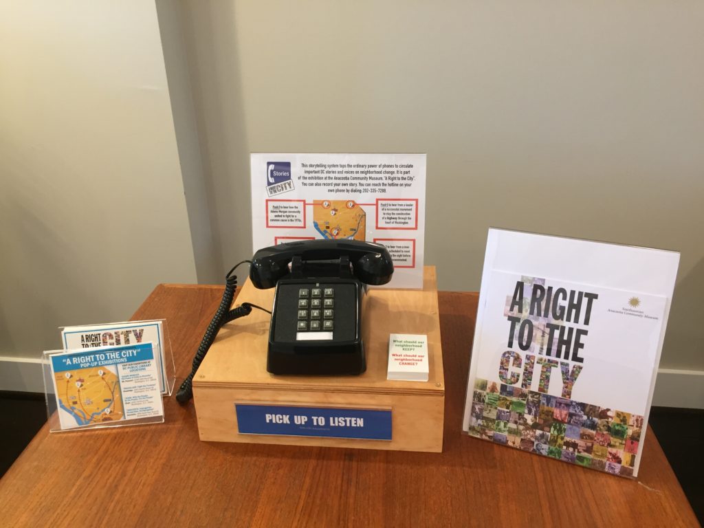
The result:

This was “Version 1” of the classic phone mount. We used slabs of hobby wood and planks, and stained it to a Honey Oak tone. The aesthetic choices were meant to be a step up from plywood to something more substantial and something that was a nod to the age of the classic push-button phones that were on the mount. Additionally, for aesthetics and cable management a half-inch hole is drilled into the top of the mount to allow for all the cables to be fed through the underside of the mount. The integration of the signage was less of an aesthetic and more of a durability choice; if the signage is integrated into the mount, there’s less of a chance that the sign will be knocked over or get separated from the rest of the satellite exhibit.
Upon testing, we found that our partners were indeed receptive to the size and overall footprint of the mount being roughly one square foot. Reception desks and circulation desks became a popular choice for the location of the mounts, giving a high level of visibility for the project. From a logistics standpoint, the physical mount could be up and ready in roughly five minutes. Including a smooth technical installation of the cloud-telephony system we could deploy the entire package within ten minutes.
For our next iteration, we focused our design on more aesthetic goals. With the natural wood, the user-experience we were aiming for wasn’t translating into the right affordances; people did not perceive the system as usable (or playable) in the ways we hoped. We wanted to increase the approachability of the mount to encourage users to engage.
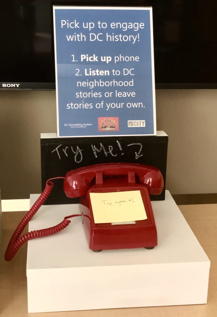
The result:

This “Version 2” came after multiple tests of the prior version where we tried painting the wood and still felt that the material had too much of a prototype feel to it. Version 2 saw a change from wood to the much smoother medium-density fiberboard (MDF). The initial build was painted in black and white for a neutral palette, however Version 2 has a trick up its sleeve: the black paint is chalkboard paint. Adding the chalkboard paint is a nod in the direction of community ownership, allowing communities or event goers to instantly express themselves with the mount. An additional aesthetic choice we began to explore was the color and potential different styles of push-button phones that could be used.
Version 2 also sought to mitigate the issue of visibility of signage. The bottom of any sign behind the phone in Version 1 is blocked by the phone and is not visible at all without picking the phone up. With the elevation of the sign, the small footprint is maintained but the sign can also be seen by the telephone user, as well as people in the surrounding area.
As we now move toward Version 3, we are investigating more interactivity — including RFID taps, push arcade buttons, and a monitor for slide shows. More on that soon!
This post was contributed by Hazel Arroyo, a Game Design graduate student at American University, with feedback from the team at The Playful City Lab.
This post was originally contributed in January 2020 on dc.storytelling.city, a Playful City Lab project website.